Horror Video Game Design Case
The functionalities
Like its predecessor, Outlast 2, aims for very simple and immediate mechanics. The game makes us live the experience of the protagonist in the first person by giving us a video camera as an aid (only in a few places it will be removed). As seen in various films (REC, Blair Witch Project), the "hand-shot" horror always has its nice effect and in Outlast 2 the camera not only serves to obtain a "more realistic" effect but has real and own gameplay features.
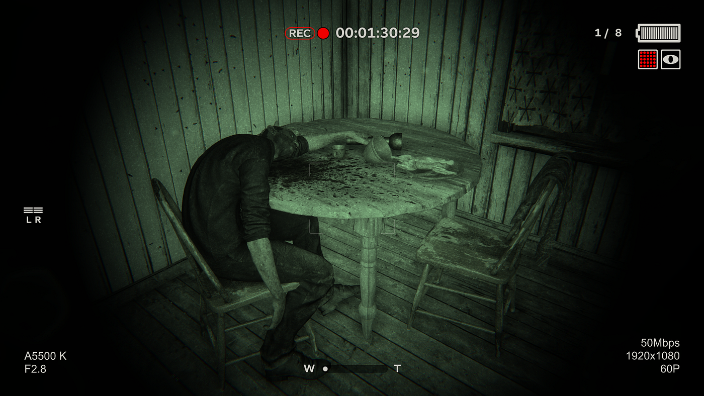
Analyzing the screen above we can see how the game's HUD has been designed to be minimally invasive and immersive.This is very important for a horror game.
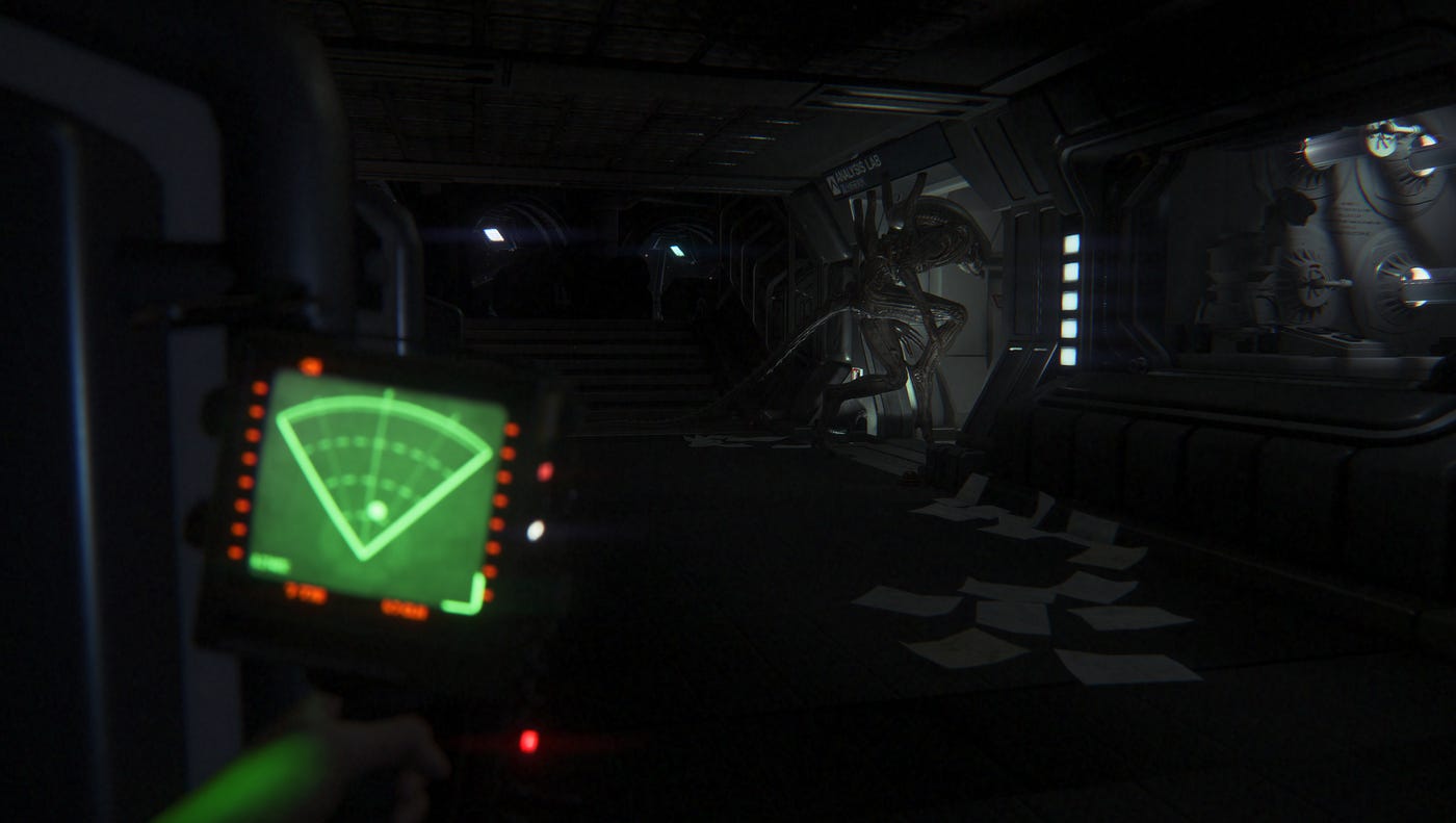
In this narrative genre, the focus MUST always be on what we are doing and have less and less contours as possible. An example of perfect UX can be found in the video game Alien Isolation (2014, Creative Assembly, SEGA)
Some components of the HUD are useful only as an aesthetic factor and not for functionality, for example, in the image below, all the information found in the lower part is only there to complete a HUD that calls a camera. They have no use in terms of gameplay.
In Outlast 2 there are 3 different types of visualization: Camera off, Camera On with infrared off, Camera On with infrared on. Once the camera is turned on, at any time we could activate or deactivate the infrared mode which will bring some changes to the gameplay. Let's go in order:
Camera OFF
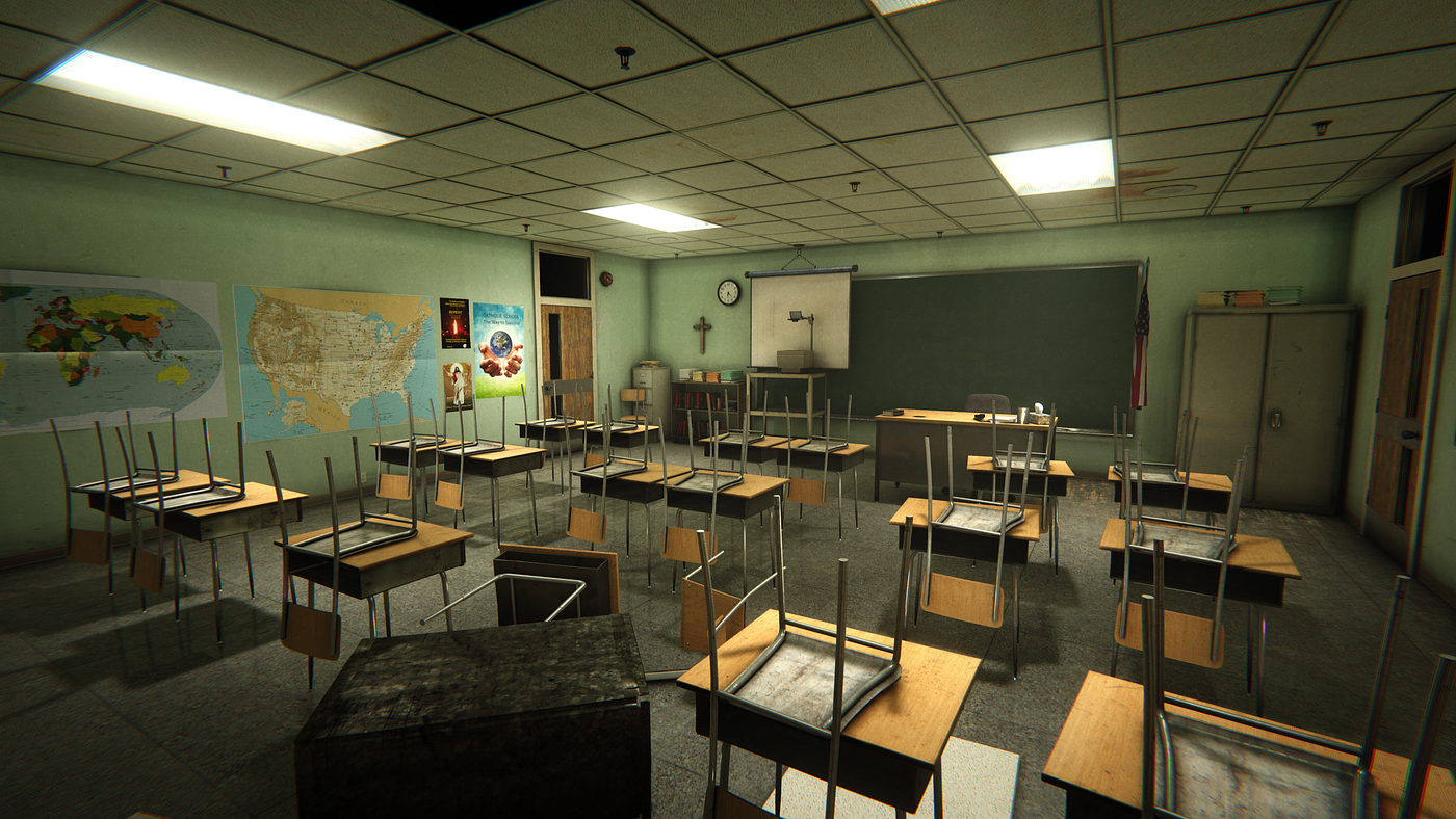
In this mode we simply have no HUD. The desired effect is to obtain a total cleaning of the game image to simulate the first person view.
Camera ON

The view moves inside the camera and a HUD layer appears that gives us some more or less important info.
Infrared
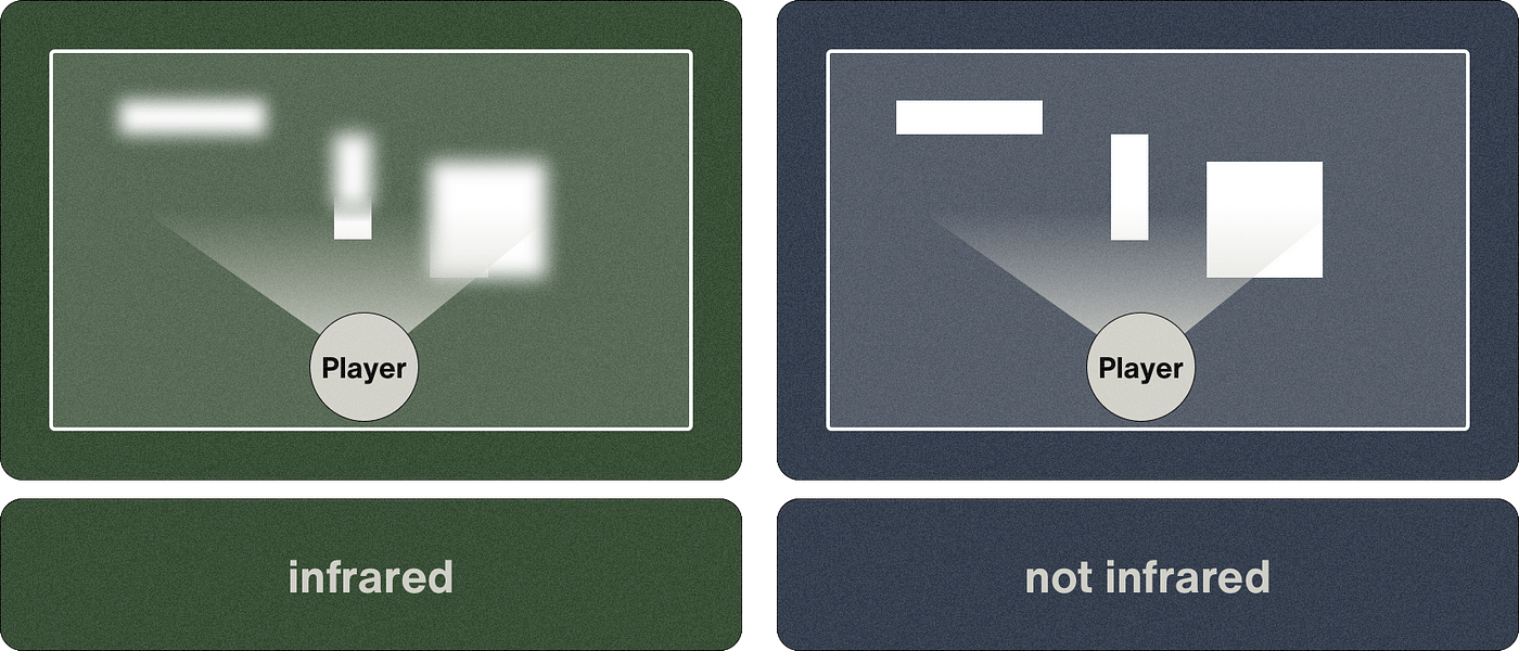
As I said before, during the game we could at any time switch from the normal camera view to the infrared camera view.
This will allow us to see in the dark but will limit the view to only a few meters and will consume the battery more quickly. These two critical issues of using the infrared mode will force us to choose the right moments in which to activate it.
As in Alien Isolation, Red Barrel in Outlast 2 used this ingenious gameplay technique making the game more alive, more real.
The question that you could probably ask yourself now is: Now that we know what effect the different views have (Camer ON, Camera OFF and infrared), what is the real difference between the camera on and the camera off, excluding infrared? Let's analyze the features of the HUD that appears every time we have the camera turned on:
STBY and REC

In some points of the story the protagonist will decide to record some areas that can be reviewed immediately afterwards in the camera menu.
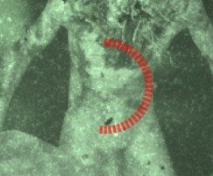
The REC information in addition to a completing circle in the center of the screen clearly tells us that the protagonist is trying to record something. The circle goes towards completion the more we frame in the right direction and if we look away, the circle will freeze and start blinking for a few seconds before disappearing and stopping the recording.
Here is a small flow to better explain the UX of the recording:
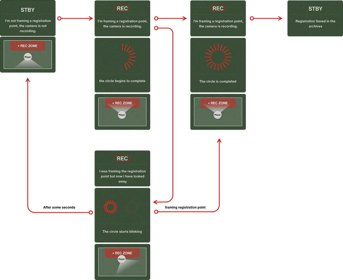
The blinking of the red circle when we look away from the "REC ZONE" is a classic used to indicate that that circle will soon disappear and with it the action will be canceled.
Battery Icon

The battery system is a very important element in Outlast 2 and it is very simple. The camera has its own autonomy and after some time it is used (especially in infrared mode), the batteries run out and we will not be able to use it.
To continue using the camera we should insert a new battery (which we can find from time to time in the game). Nothing complicated or unnatural, right?
The HUD in question has 2 states: White when the charge bars are in the first 3/4 of the battery, Red the rest of the time.
The Microphone

By activating the microphone function we would be able to locate the position of enemies around us through a simple graph (L)eft and (R)ight.
The mechanics are very simple and immediate: there are two bars, just look where the bar is highest to understand if the enemy is on the right or left.

Functionalities Icons

There isn't much to say here. These 3 icons indicate what status the camera is in (in this case it has the microphone off and the infrared on). Just a small note: infrared is divided into 2 icons but they are always activated or deactivated together. it is clear that the designer wanted to divide "infrared" from "Night vision" but this has no practical effect on the game.
Useless information

This information is purely aesthetic and serves to increase the player's immersion in the moments when the camera is active.
Last but not least, the room menu
As mentioned before, from time to time in the game we may record videos that will be saved in the archive. This archive can be opened at any time and is shown as if we are actually looking at the camera. For this reason, the designer decided to take inspiration from the handycam UI of a few years ago.
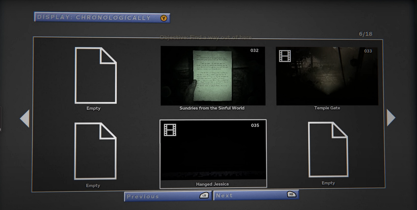
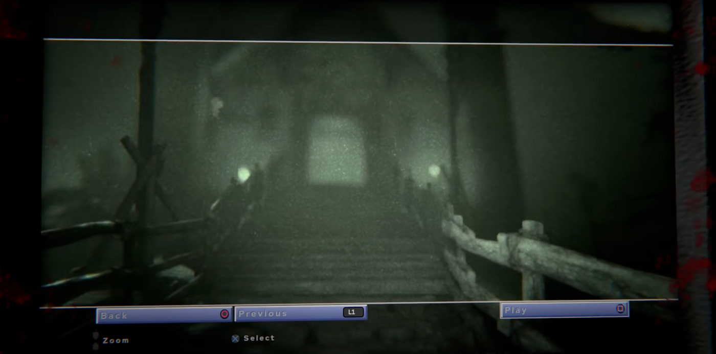
Honestly, I don't like the work done here. Cute in the style of colored buttons but a bit poor in the gallery part. The extreme cleanliness created for the use of in the shooting and infrared modes is not repeated in the internal menus which therefore do nothing but create a sense of detachment.
Horror Video Game Design Case
Source: https://bootcamp.uxdesign.cc/ui-ux-in-video-games-outlast-2-bffb992ba12f
Posted by: powelltheretion.blogspot.com

0 Response to "Horror Video Game Design Case"
Post a Comment